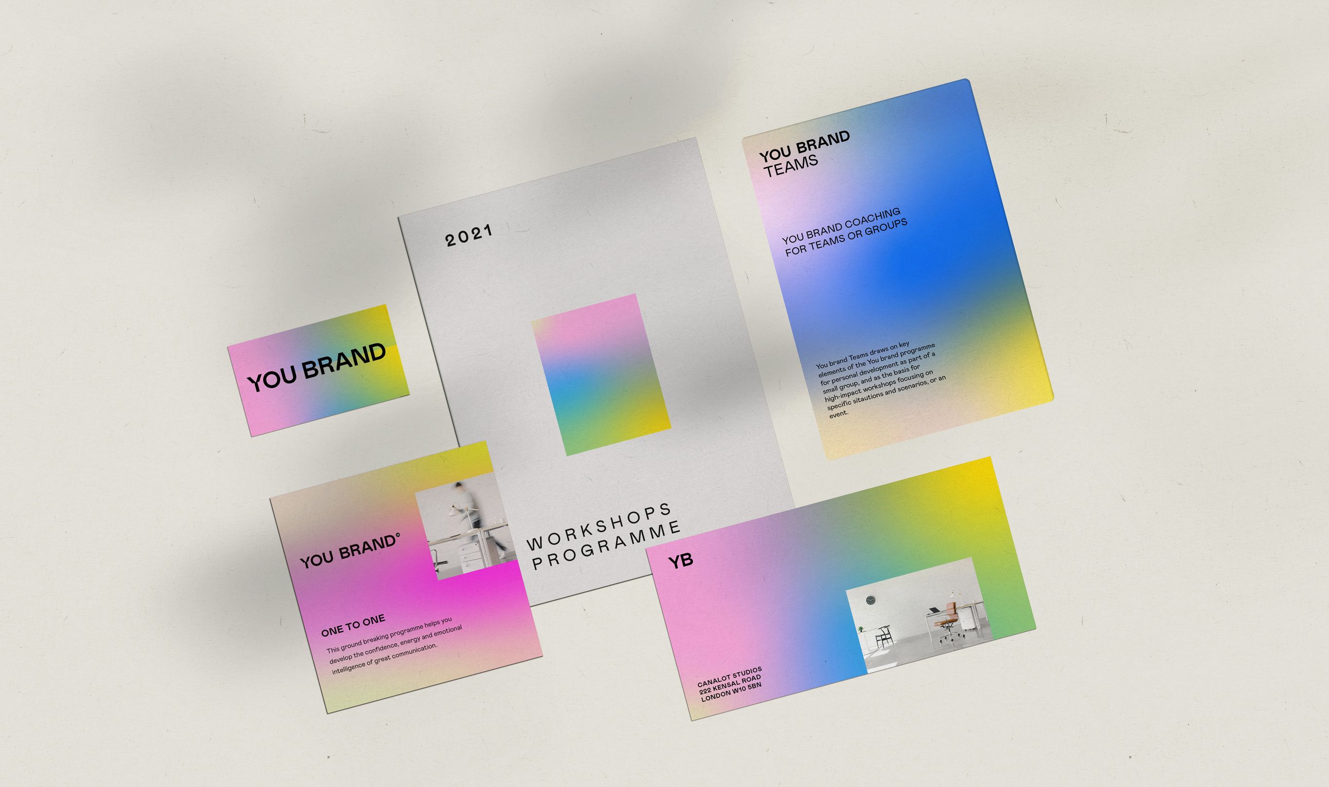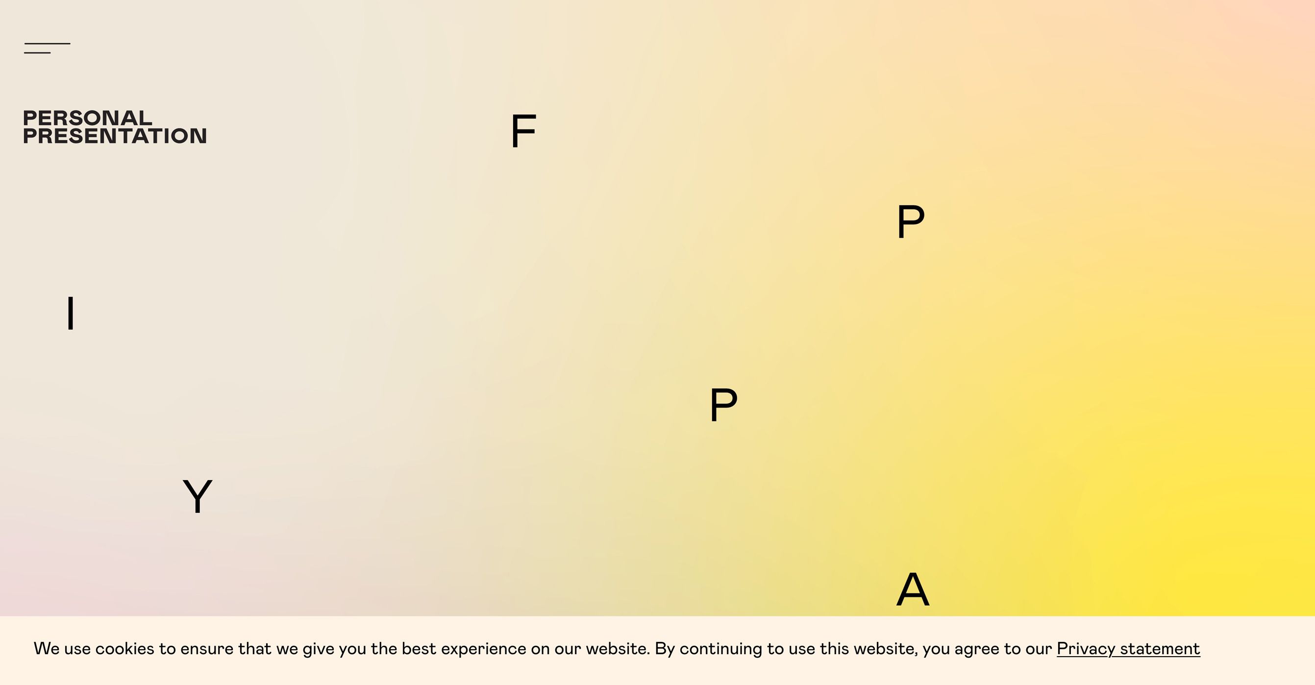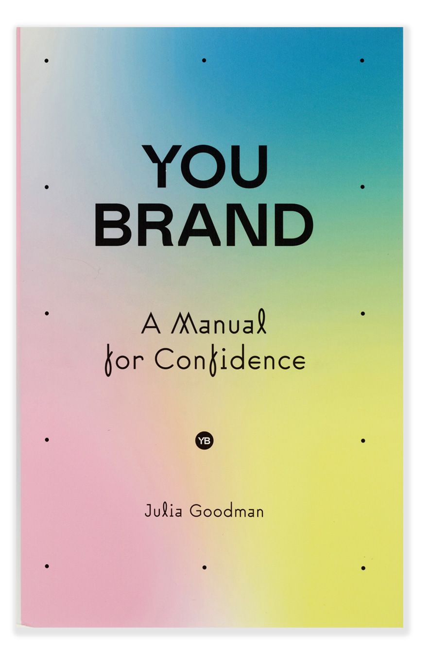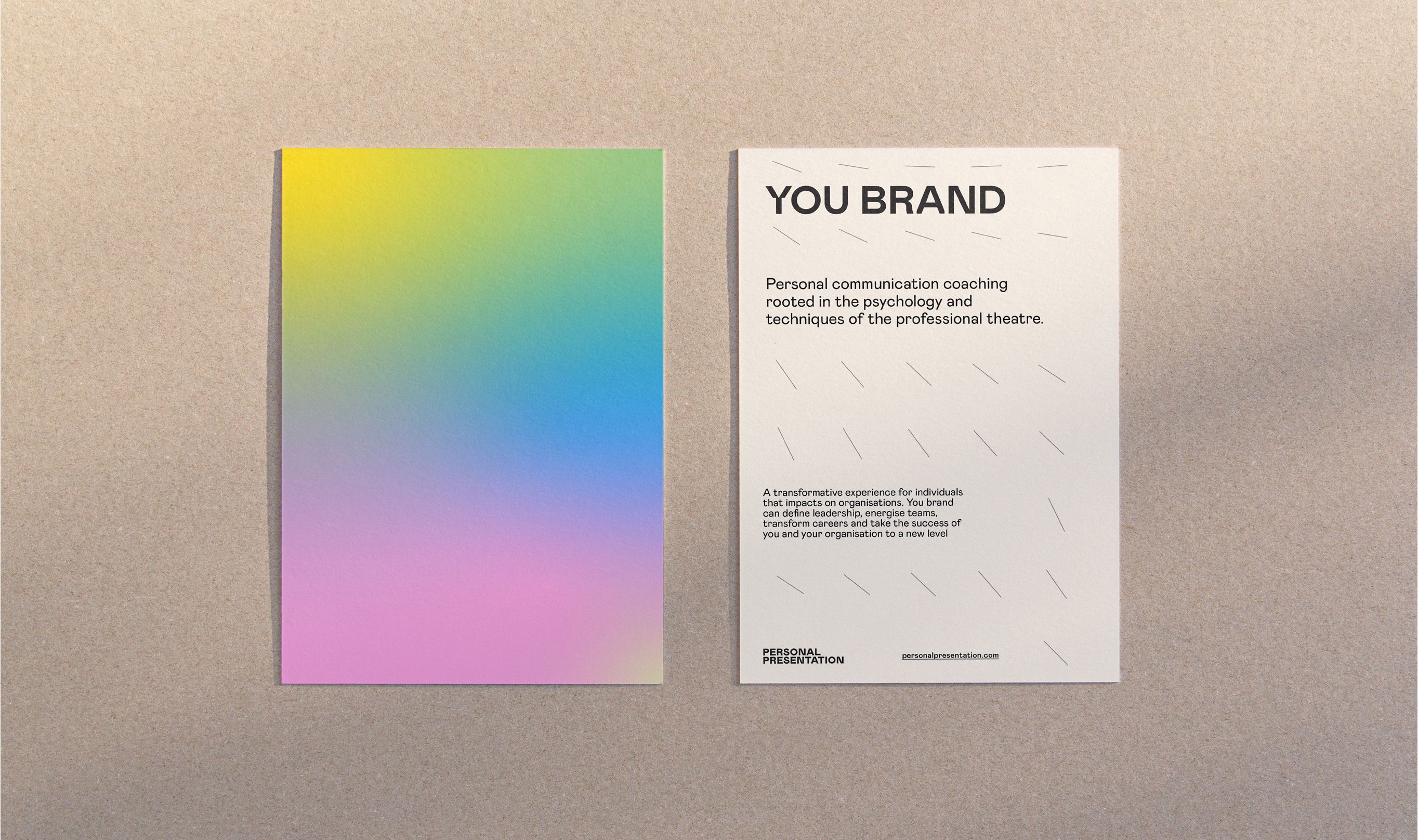
You Brand
Prismatic colours contrasted with understated graphics created branding for a management training company that is professional without being corporate.
You Brand management training wanted fresh and modern branding that reflected its unique standpoint, that of using actors to help people in a corporate environment be their authentic selves.
CHK employed a series of soft and diffuse spectrums as a visual metaphor for the collective diversity of individuals. A subtly refined sans serif logo gives a contrasting harder edge.
Each publication, programme and marketing material uses a different part of the spectrum so it has its own identity within the overall branding family. Pared back graphics on the printed materials keep the overall feel factual.