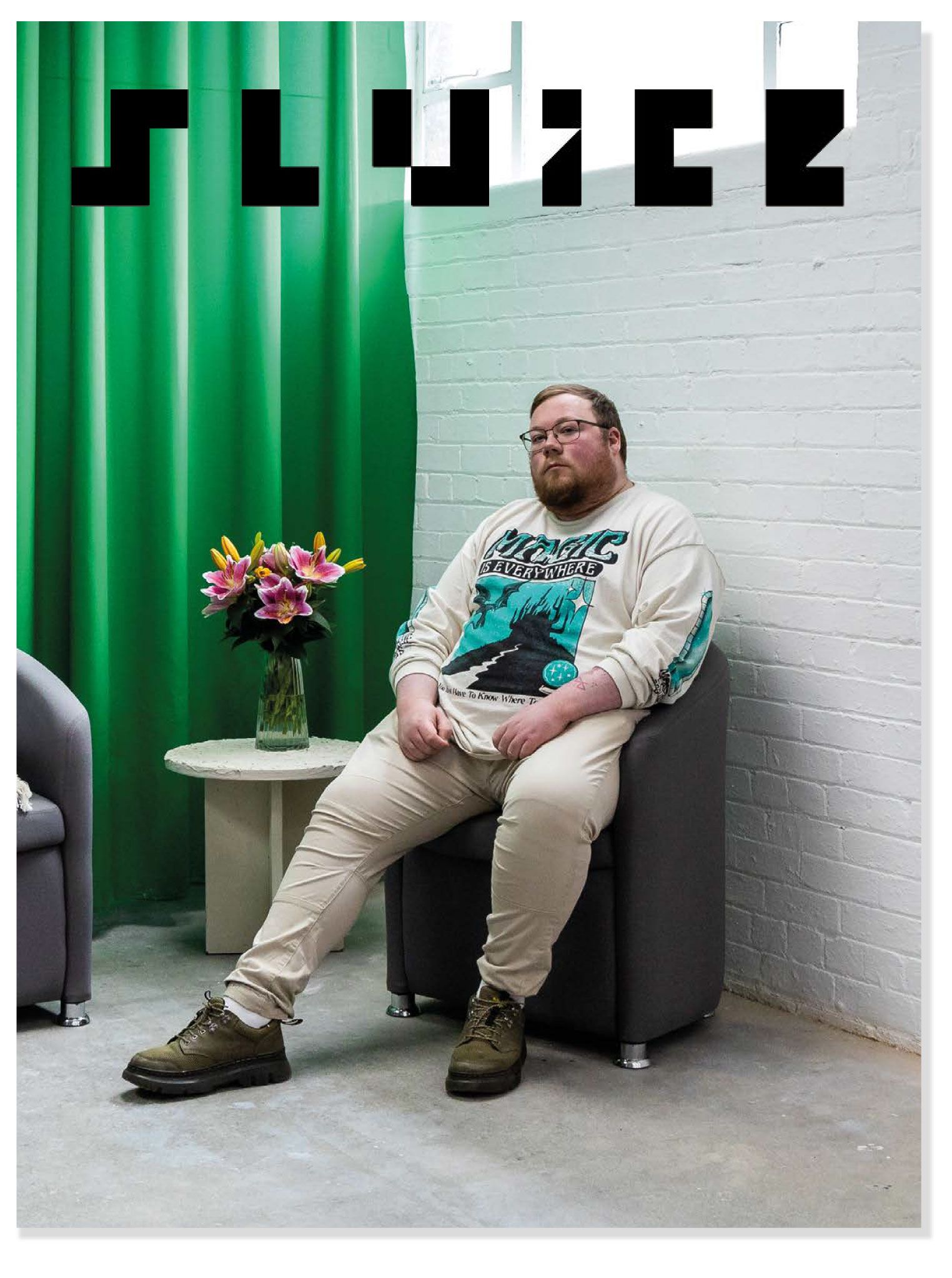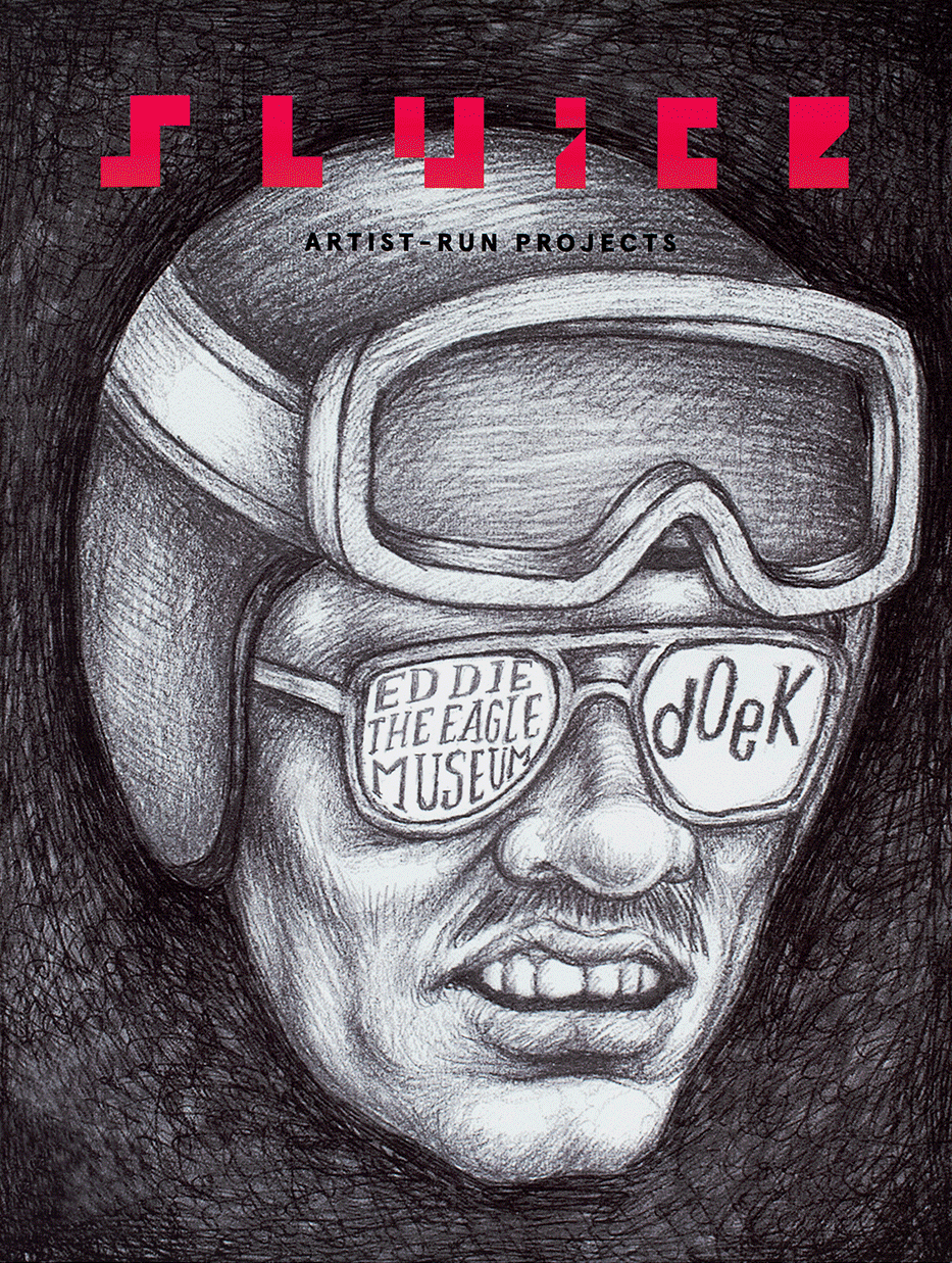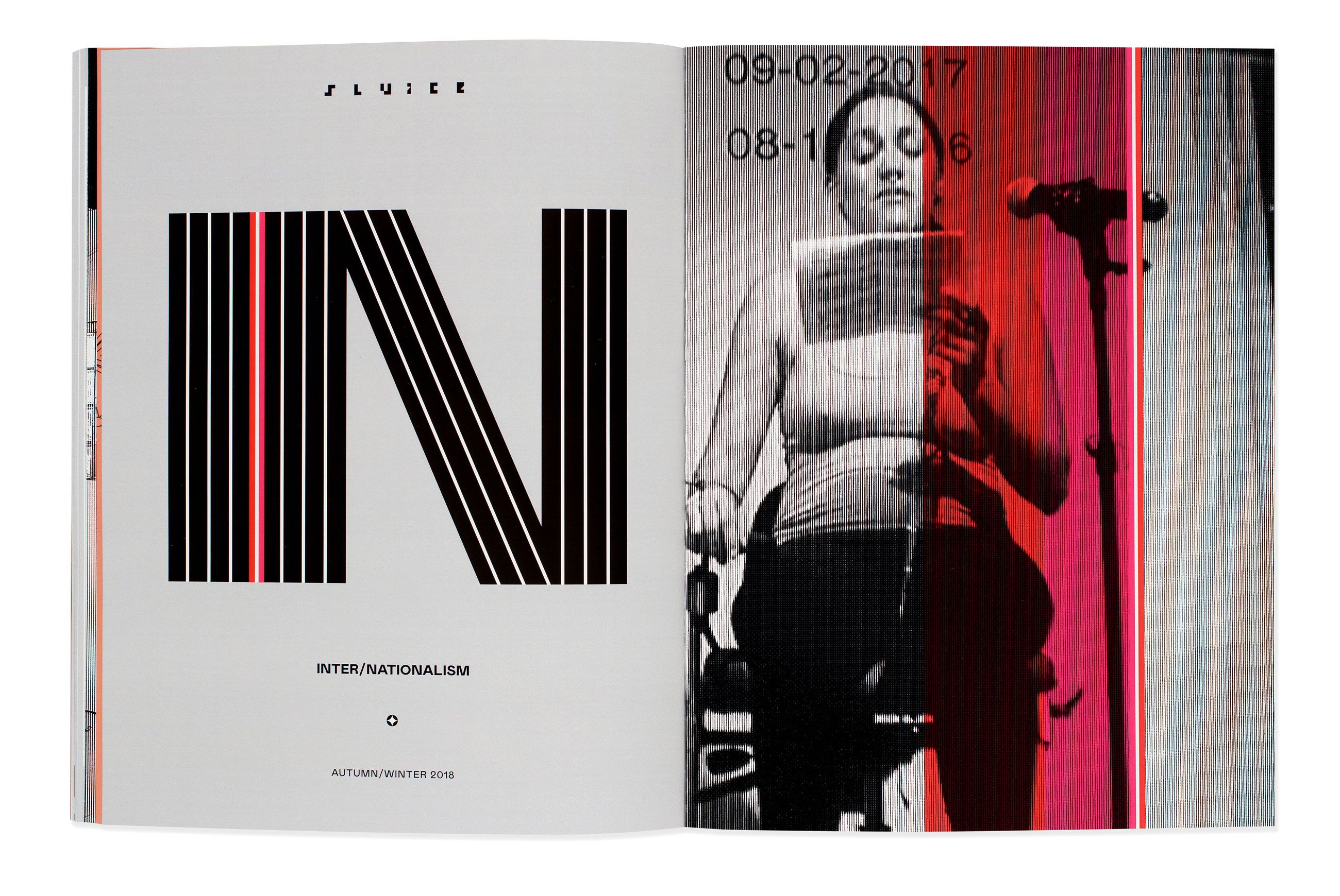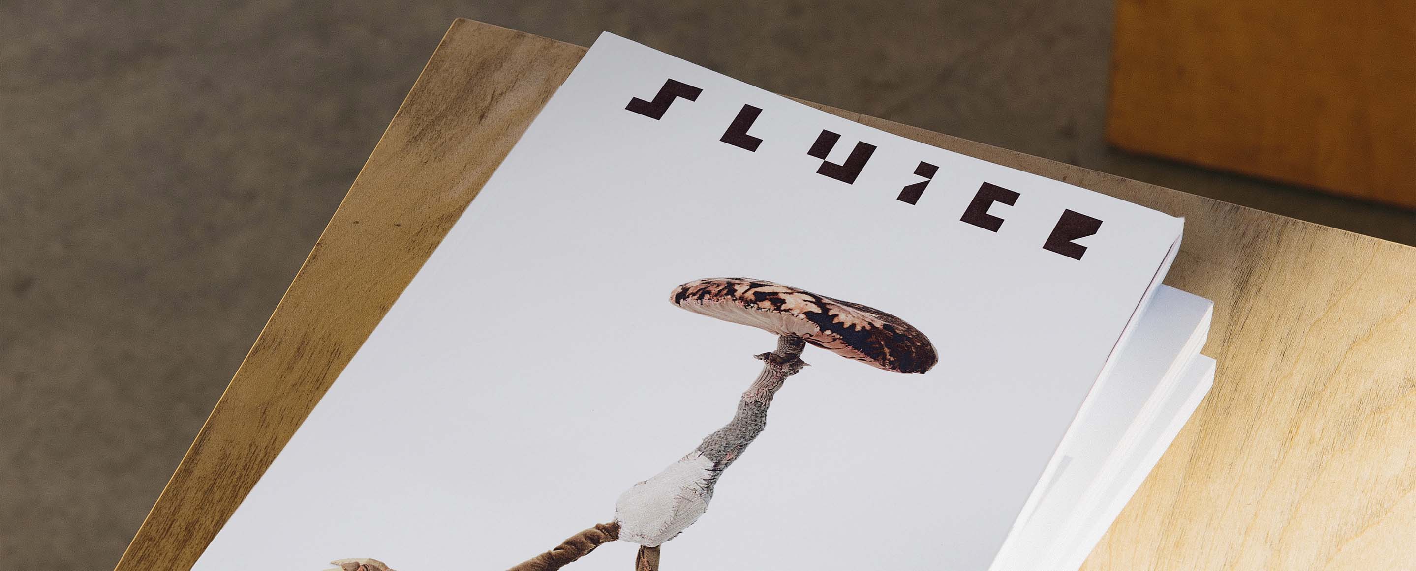
Sluice
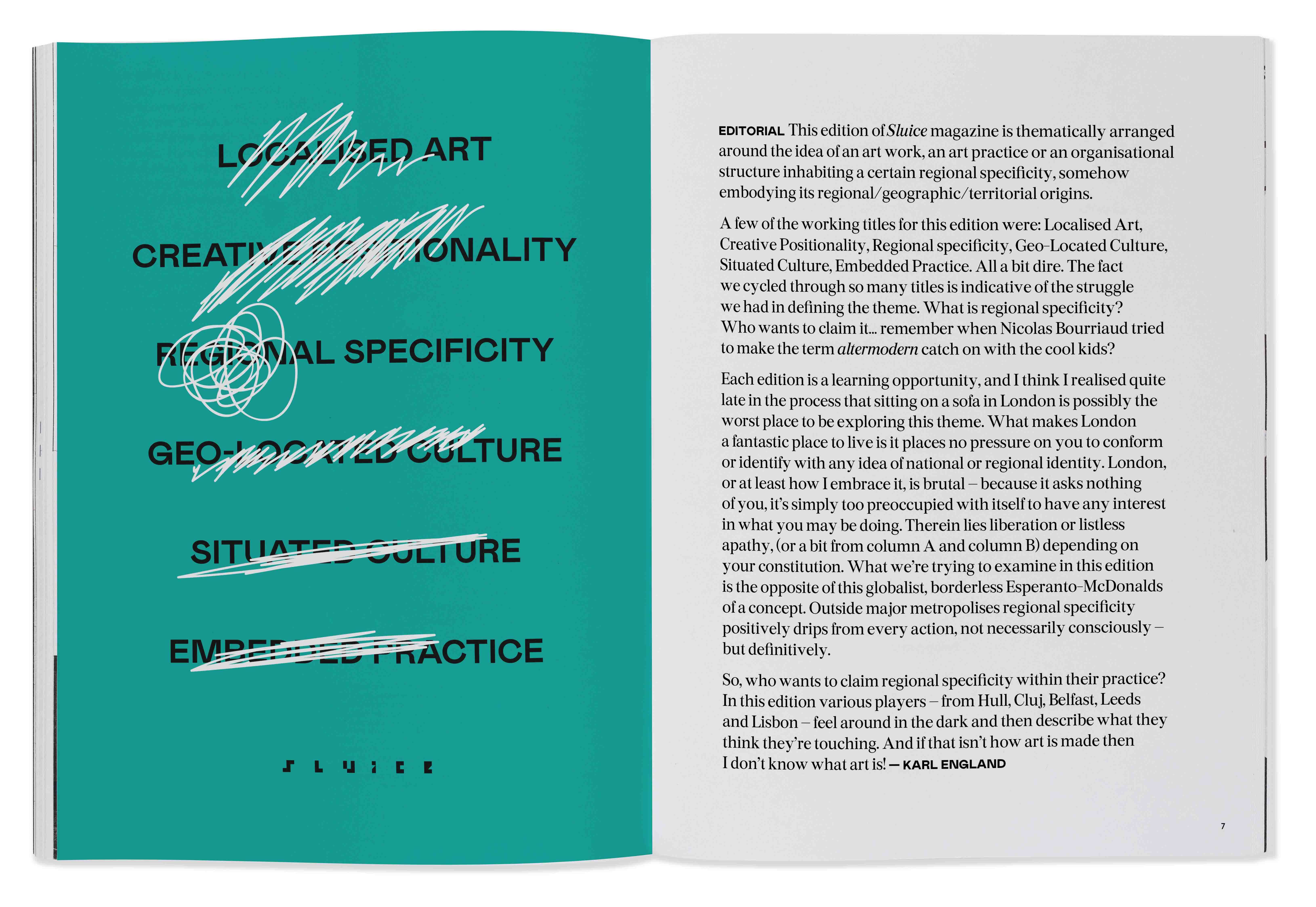
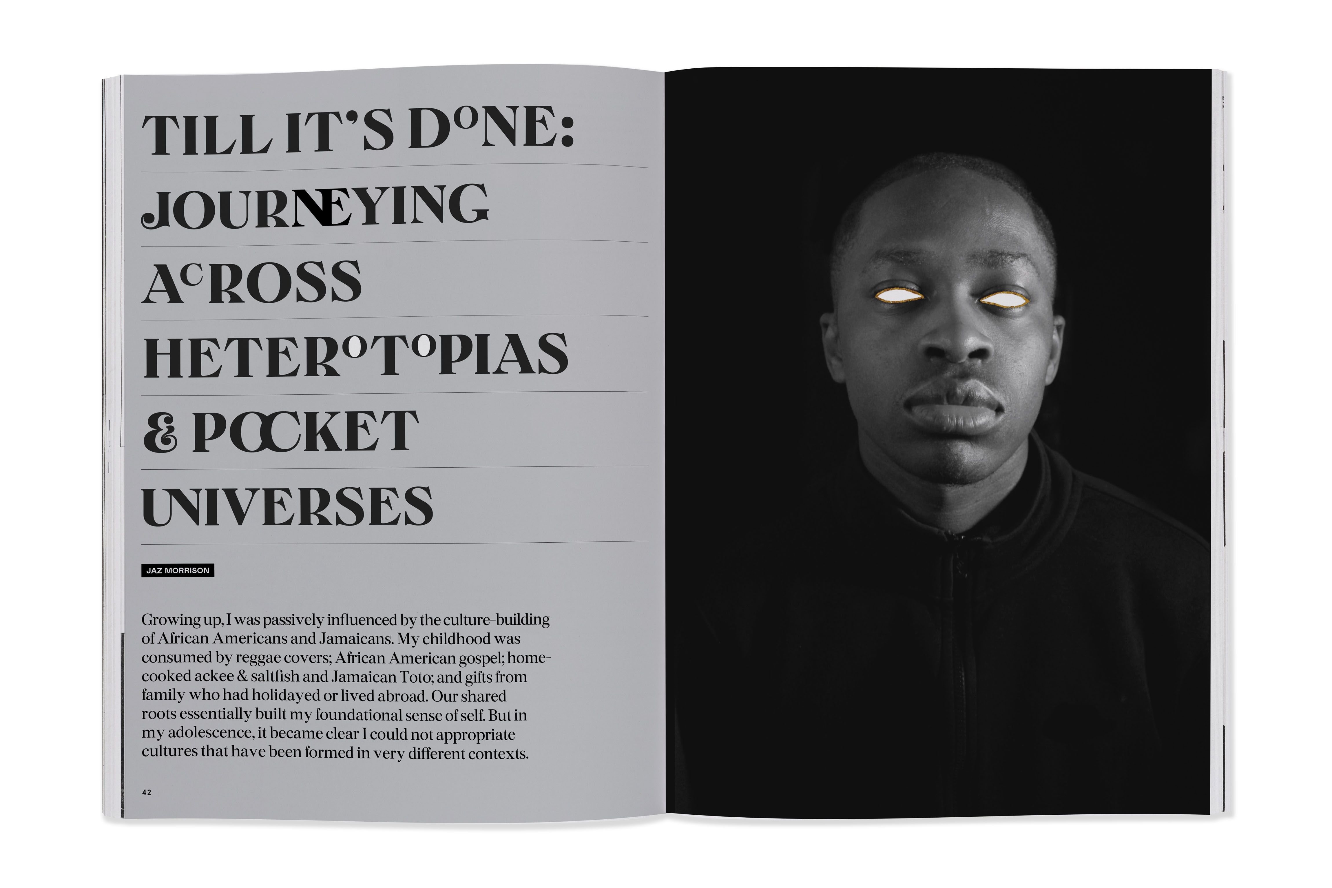
An arts magazine needed branding and house style that was easily identifiable but could have a different look and feel every issue.
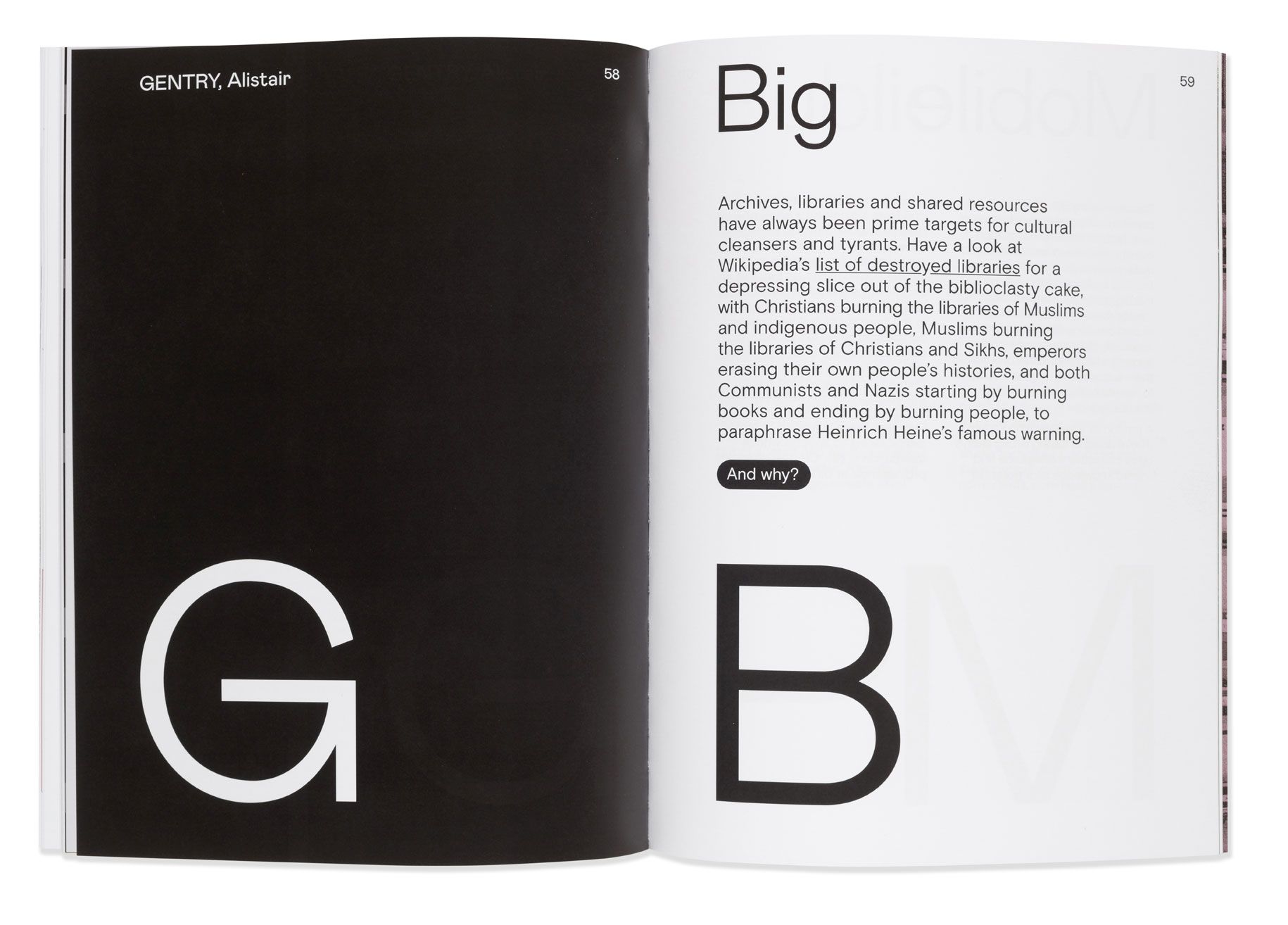
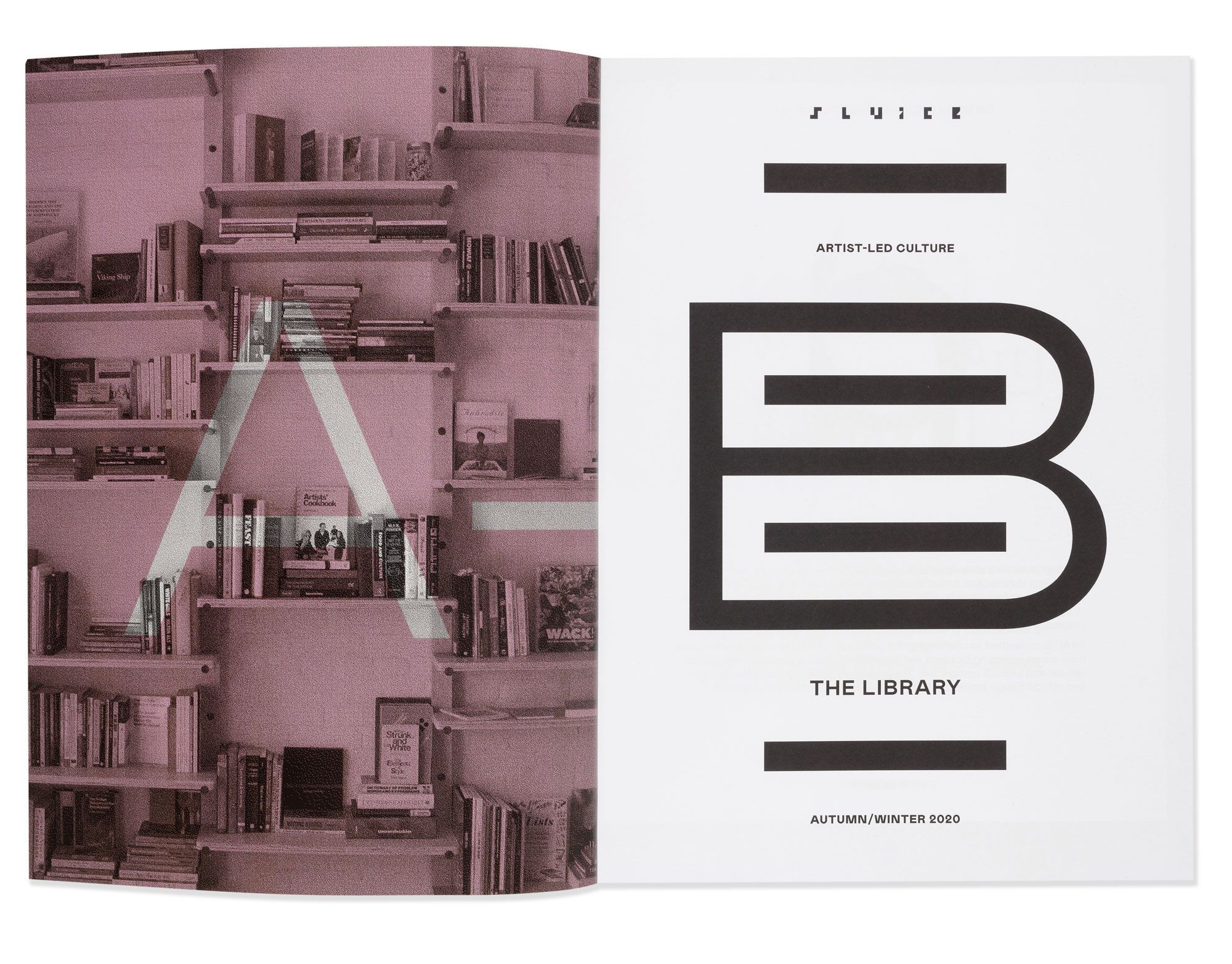
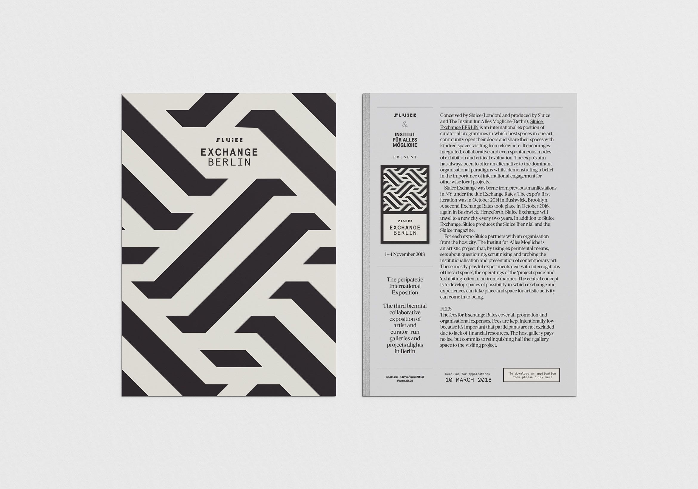
The arts magazine and collective Sluice needed branding that was quirky, esoteric, and individual. In response, CHK designed and implemented a bespoke font based on the barcodes found on 35mm film canisters.
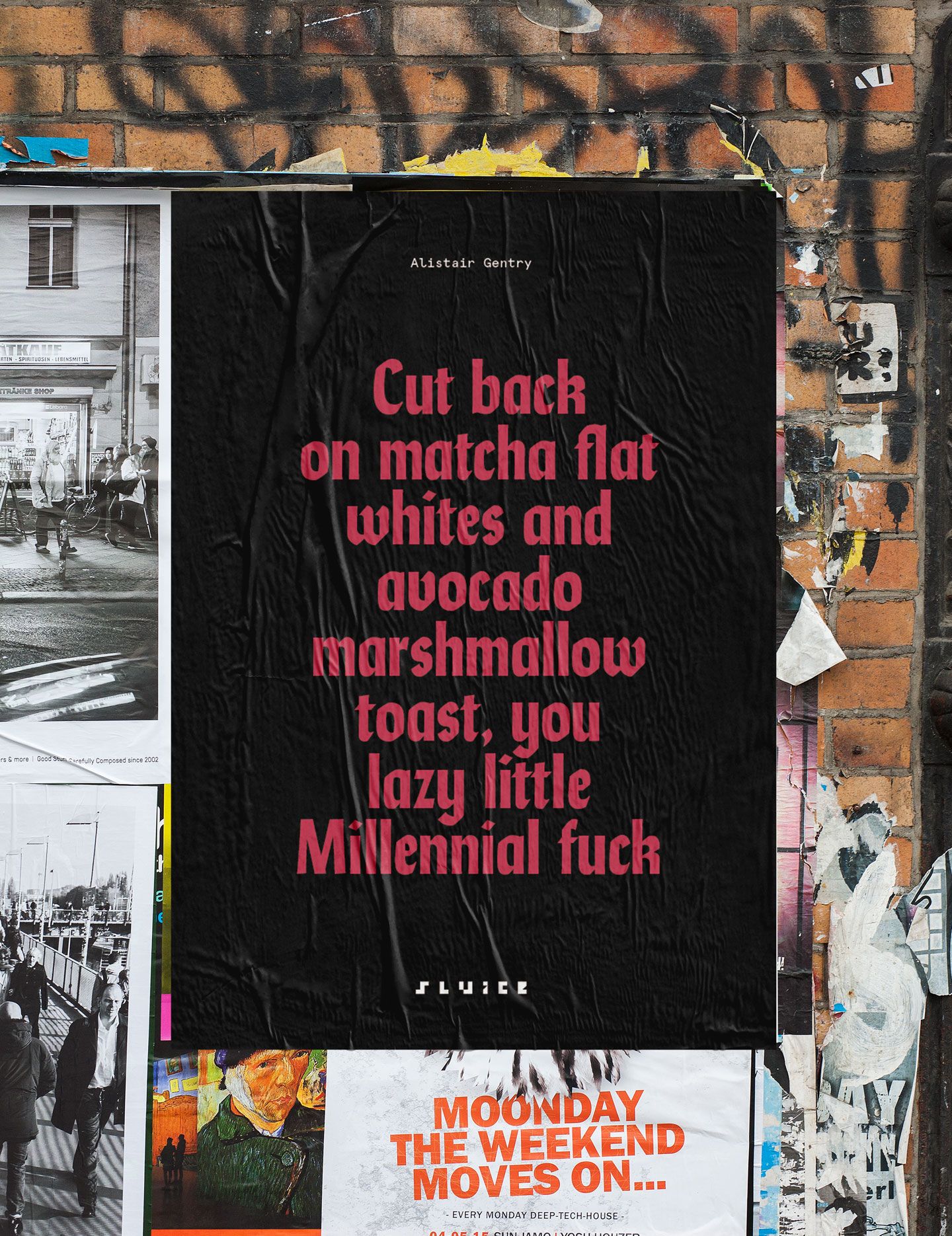
CHK applies this highly conceptual art direction to each issue of the magazine and has won a Creativepool Award for their originality.
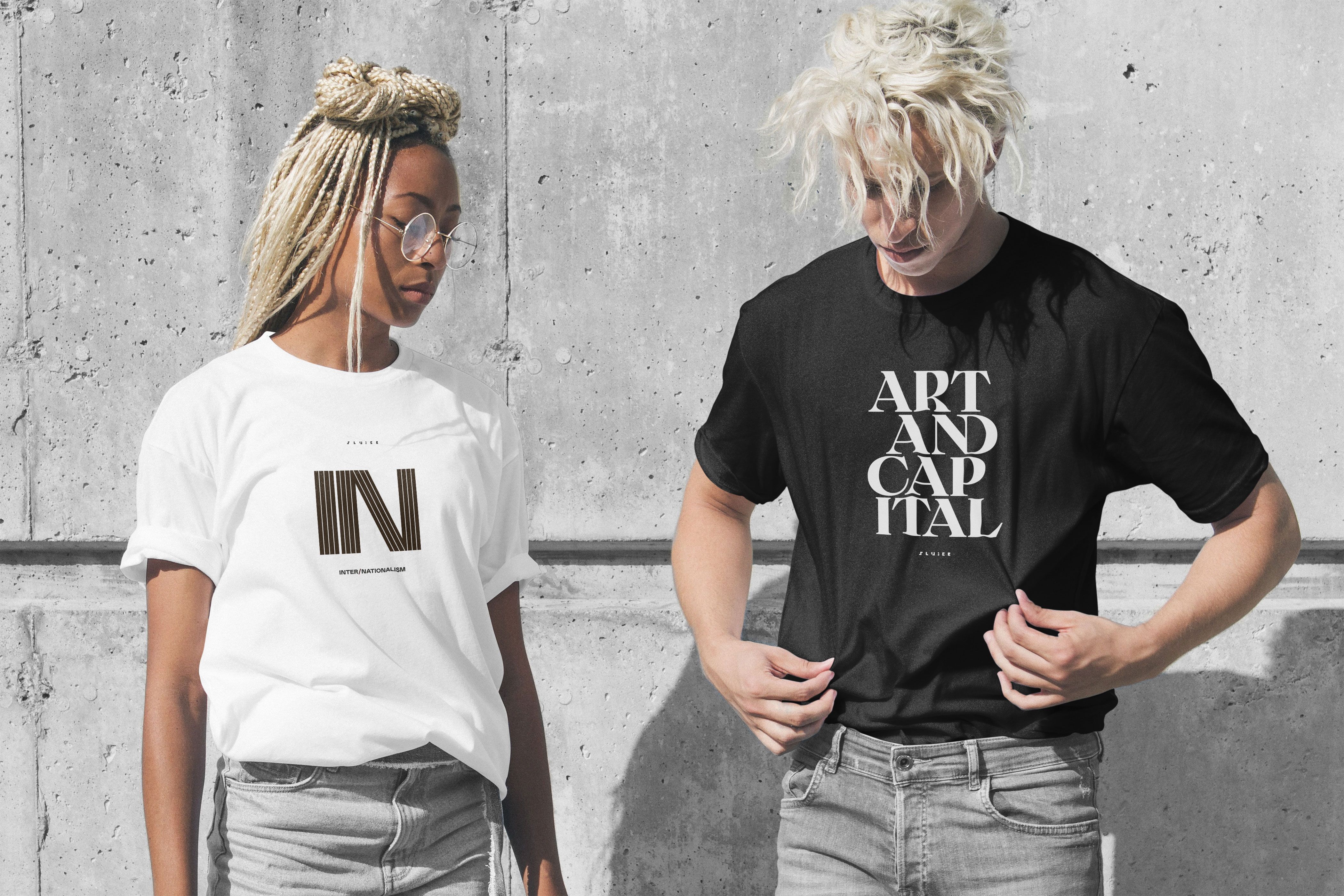
Such are the artistic merits of the design that also Sluice commissions CHK to create associated merchandising for each issue.