Landform
A comprehensive website redesign brings order and visual appeal to a huge body of content for a large-scale property developer. A refreshed logo gives a strong corporate identity.
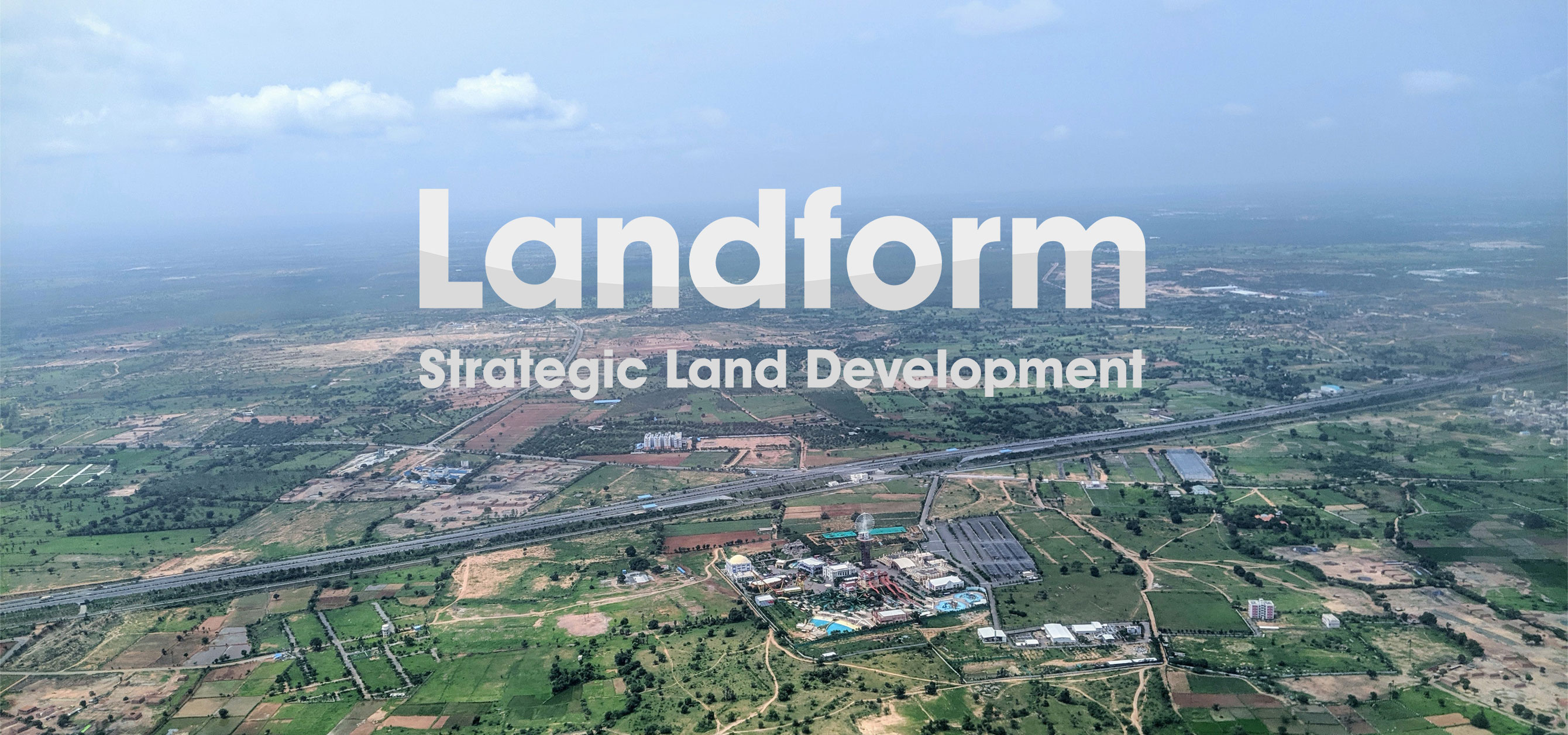
CHK refreshed the site and logo of this strategic planning developer. CHK created a two-tone grey scale logo with an undulated line that referenced the shape of hills on a landscape.
A systematic wireframe brings order to the content-dense website while grey grid lines based on ordnance survey map lines frame the text and images. This elegant solution elevates the relatively mundane imagery while honouring the brand’s corporate nature.

